Last updated: January 29, 2024
Available with any of the following subscriptions, except where noted:
 Marketing Hub
Professional
,
Enterprise
Marketing Hub
Professional
,
Enterprise
|
 Content Hub
Professional
,
Enterprise
Content Hub
Professional
,
Enterprise
|
| Legacy Marketing Hub Basic |
As you design your marketing email, you can preview how it looks on different device types and email clients. If you notice your email doesn't render as expected on specific clients, read through the best practices and fixes for common issues below.
Preview your email on mobile devices and desktop clients
Before sending your email, you can preview what it will look like across different clients and devices.
- In your HubSpot account, navigate to Marketing > Marketing Email.
- Click the name of an existing drafted email.
- In the top right of the email editor, click the Actions dropdown menu, then click Preview.
- Review how your email will look on both a wider desktop screen and a smaller mobile version
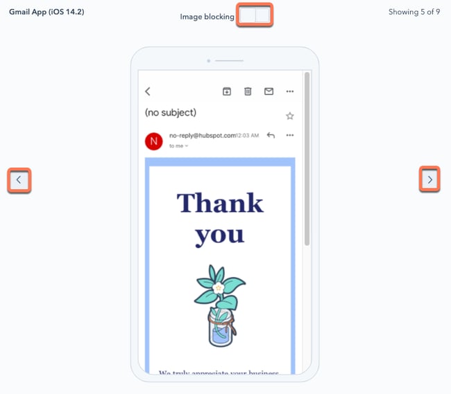
- To preview how your email will appear in specific email clients, click Clients at the top of the preview screen.
- In the left pane, select the checkbox next to any email client you want to preview.
- In the upper right, click Test my email now. HubSpot will generate previews for each of the clients you selected.
- Click the < or > buttons to navigate between client previews.
- By default, many clients will initially disable images when the email first loads. To see how your email appears without images, toggle the Image blocking switch on.
Fix Gmail clipping issues
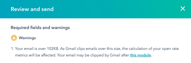
If the total size of your email, including any embedded code in the markup of your message, exceeds 102 KB, Gmail will clip your email. To view the full content of your email, your recipient will have to click the View entire message link, which may negatively impact your sending reputation, and also interferes with HubSpot's ability to track interactions with your email.
If your drafted email is at risk of being clipped in Gmail, a warning will appear in the Review and send panel. This warning is based on an approximation of your email size, based on the HTML of your email and its associated tracking links.
To prevent Gmail from clipping your email, you can follow the steps below:
- Reduce the number of links in your email: each tracked link in your email includes HubSpot's tracking parameters at the end of the URL. These links can vary in length, but each one can often be hundreds of characters long, which contributes to the size of your email.
- Trim out any extra content: revise your email to remove any content that's not essential for your recipients to read. You should also check for code or styling that you may have included if you copied content from a separate editor. Keep in mind that removing large images won't significantly reduce your email's size, since they're loaded separately from the content of your email.
- Avoid sending multiple emails with the same subject line: if you send multiple emails to a recipient that have the same subject line, Gmail will automatically combine them into a single thread, even if the more recent email included new content.
- Test out your email after making changes: after you revise your email to reduce its size, send a test email to a Gmail account you own to verify that your email appears as you'd expect without any clipping.
Make your email mobile friendly
Though it's difficult to design your email to appear perfectly between desktop and mobile, you can follow the tips below to best ensure a consistent mobile experience.
Use a responsive email template
All HubSpot drag-and-drop templates are responsive by default. This means the content adjusts to fit the screen it's viewed on. HubSpot also adds a max-width to images in the content editor, so you don't have to worry about editing the source code to add max-widths.
If you're creating a coded email template in HubSpot, be sure to use our responsive email template markup. You can also purchase a responsive email template from the Template Marketplace.
Reduce image file sizes
In most cases, download speeds on mobile devices are slower than on desktop. Use smaller image files to decrease your email load time. HubSpot automatically resizes your images that include a width attribute in an <img> tag. Services such as FastStone Photo Resizer and JPEGmini can also reduce file size by as much as 80% without reducing the quality of your image.
Increase the size of links and CTA buttons
Make sure your content is large enough to be read clearly on a mobile device. To ensure your subscribers can see and click on your content clearly, make sure any text links and CTA buttons are taller and wider than 57x57 pixels.
Troubleshoot email preview text
When your email appears in a recipient's inbox, email clients such as Gmail or Outlook may render additional content from the body of your email after the subject line and preview text. This behavior may result in unintended text after the preview. For example, if you included an image such as a banner or logo at the top of your email, the image's alt text might be included in the email's preview.

To prevent this issue, you can try providing a summary of your email's content as the alt text of an image at the top of your email, or you can omit the alt text altogether. To confirm that the full preview text appears as expected, you can send yourself a test email.
Avoid using JavaScript and inline frames
If you're using the classic email editor to create your emails, you should avoid using <script> or <iframe> elements in your template, since they won't be rendered by most major email clients. If you're adding an <iframe> to an HTML element to insert a video into your email, you should opt for using the video module instead.