Last updated: April 3, 2024
Available with any of the following subscriptions, except where noted:
 All products and plans
|
In theme templates and coded templates with drag and drop areas, you can hide specific modules on mobile devices, or add mobile-only margins and padding. Your page content itself can only be edited in the desktop version of the editor.
Please note: only default HubSpot themes and some marketplace themes include mobile editing - custom themes do not include mobile editing by default. To implement mobile editing, HubSpot recommends that you work with a developer to install mobile breakpoints.
-
Navigate to your content:
- Website Pages: In your HubSpot account, navigate to Content > Website Pages.
- Landing Pages: In your HubSpot account, navigate to Content > Landing Pages.
- Hover over your page and click Edit.
- At the top of the page, click the mobile icon

- Click a module to customize how it appears on mobile devices.
- In the sidebar editor, click the Visibility section, then select Show or Hide. Hidden modules will still appear on the desktop version of the page.
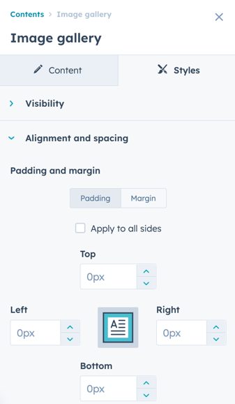
- To edit this module's spacing on mobile devices, click the Alignment and spacing section, then select Padding or Margin. Enter pixel values in the Top, Left, Right and/or Bottom fields.
- To return to the desktop version of the content editor, click the desktop icon at the top of the page.