Last updated: April 3, 2024
Available with any of the following subscriptions, except where noted:
 All products and plans
|
In HubSpot, you can create website and landing pages for your website. You can customize page content and settings, as well as optimize pages for search engines.
Before you get started
- Verify that you have the Write permission for the type of page you want to create. To publish pages, you will also need the Publish permission.
- Make sure that your page domain is connected to HubSpot for publishing. If you're using HubSpot's free tools, your account includes a HubSpot-branded domain that's ready for publishing.
- Understand the different types of page template available in HubSpot:
- Theme templates support drag and drop editing features, unique theme modules, and customizable theme styling.
- Custom templates are created in the design manager, either in the layout editor or using custom code. Drag and drop editing features are only available on custom templates with drag and drop areas.
-
Navigate to your content:
- Website Pages: In your HubSpot account, navigate to Content > Website Pages.
- Landing Pages: In your HubSpot account, navigate to Content > Landing Pages.
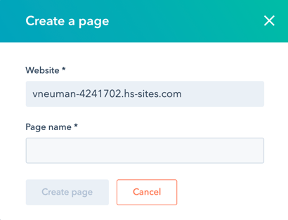
- In the upper right, click the Create dropdown menu and select Website page or Landing page.
- In the dialog box, specify a name and domain for the page:
- Click the Website dropdown menu and select a domain for the page's URL. If you don't have any connected domains, your account's default system domain will be the only option.
- In the Page Name field, enter an internal name for the page.
- Click Create page.
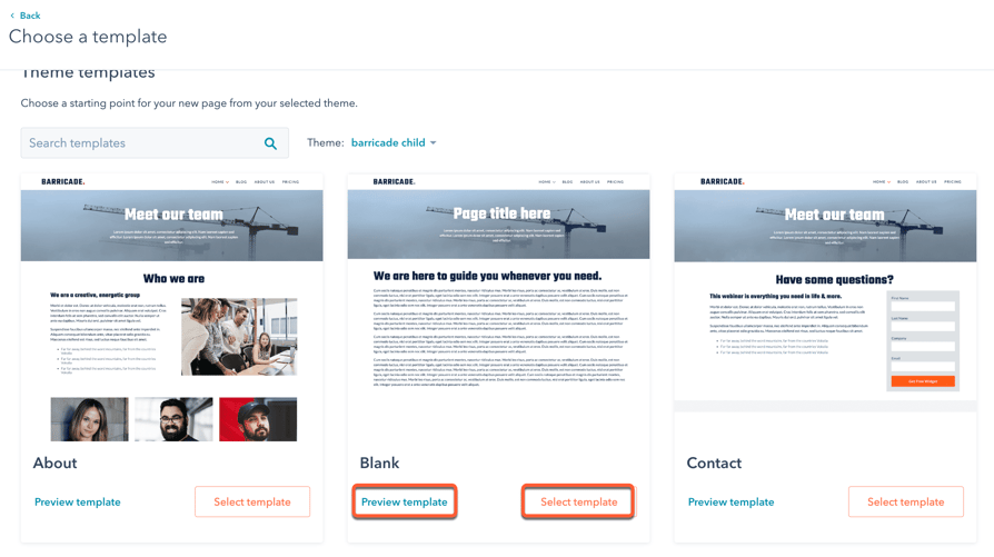
- On the template selection screen, templates from your active theme will appear at the top of the page, while all other templates will be in the Other templates section at the bottom. If you haven’t selected an active theme, hover over a theme and click Set as active theme.
- Hover over a template and click Preview template to open a preview or Select template to proceed to the content editor.
- In the content editor, the editing options available depend on the page's template type and modules used. Learn more about editing pages using theme templates, global content spanning multiple pages, drag and drop areas, and rich text or image modules.
Customize page settings
Once you've edited your page content, you can customize page attributes like URL, meta description, and language.
Customize basic page settings
-
Navigate to your content:
- Website Pages: In your HubSpot account, navigate to Content > Website Pages.
- Landing Pages: In your HubSpot account, navigate to Content > Landing Pages.
- Hover over a page and click Edit.
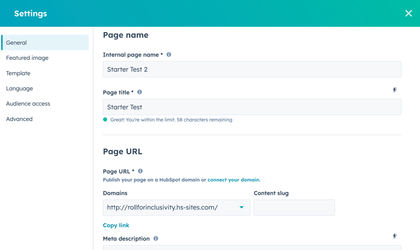
- Click the Settings menu and select General.
- In the dialog box, enter an internal name in the Internal page name field. This name will not be visible to visitors.
- In the Page title field, enter an external name for the page. This name will appear in the tab at the top of a visitor's web browser when the page loads.
- In the Page URL section, click the Domains dropdown menu and select the domain where your page will be hosted. Then enter a URL slug in the Content slug field. Learn more about editing a page's URL.
- In the Meta description field, enter a description of the page's content that will appear in search results below the page title.
- If you have a Marketing Hub Professional or Enterprise subscription, you can associate the page with a campaign:
- To associate your page with an existing campaign, click the Campaign dropdown menu and select a campaign.
- To associate your page with a new campaign, click the Campaign dropdown menu and click Create campaign. Then, continue setting up your campaign.
-
- If you've never created a campaign before, click Create a campaign. Then, continue setting up your campaign.
Set the featured image
To add a featured image to be included when the page is shared on social media:
-
Navigate to your content:
- Website Pages: In your HubSpot account, navigate to Content > Website Pages.
- Landing Pages: In your HubSpot account, navigate to Content > Landing Pages.
- Hover over a page and click Edit.
- Click the Settings menu and select Featured image.
- In the dialog box, click to toggle the Enabled featured image switch on.
- Click Upload to select an image from your computer, or Browse images to select an image from the files tool.
- To increase accessibility, enter a description of your image in the Image alt text field.
Change the page template
-
Navigate to your content:
- Website Pages: In your HubSpot account, navigate to Content > Website Pages.
- Landing Pages: In your HubSpot account, navigate to Content > Landing Pages.
- Hover over a page and click Edit.
- Click the Settings menu and select Template.
- In the dialog box, to select a different template, click Use different template. If you are switching the template of a published page, make sure to click Update to take any unpublished changes live. Otherwise, these changes may be lost when you switch the template.
- On the theme selection screen, select a theme.
- On the template selection screen, select a template.
- Preview how your page will look with the new template, then click Use template to finish switching the template or Back to select a different template.
Set the page language
-
Navigate to your content:
- Website Pages: In your HubSpot account, navigate to Content > Website Pages.
- Landing Pages: In your HubSpot account, navigate to Content > Landing Pages.
- Hover over a page and click Edit.
- Click the Settings menu and select Language.
- In the dialog box, click the Page language dropdown menu and select a language. Learn more about managing multi-language pages.
Set page visibility
-
Navigate to your content:
- Website Pages: In your HubSpot account, navigate to Content > Website Pages.
- Landing Pages: In your HubSpot account, navigate to Content > Landing Pages.
- Hover over a page and click Edit.
- Click the Settings menu and select Audience Access.
- In the dialog box, select an audience access option:
- Select Public to make the page's content available to any visitor.
- Select Private - Password required to add a required password for visitors to access the page content.
- In a Content Hub Enterprise account, you can also select Private - Registration required to require visitors to register with your site to view this content.
- In a Content Hub Enterprise account, you can select Private - Single sign on (SSO) required to require visitors to sign in with an identity provider, such as Google or Okta.
Set advanced page options
-
Navigate to your content:
- Website Pages: In your HubSpot account, navigate to Content > Website Pages.
- Landing Pages: In your HubSpot account, navigate to Content > Landing Pages.
- Hover over a page and click Edit.
- Click the Settings menu and select Advanced.
- To make this page a dynamic page, click the Data source dropdown menu in the dialog box and select a HubDB table or property. Learn more about working with dynamic pages.
- To add code snippets to the head or footer HTML of the page, click the Head HTML or Footer HTML field, then enter your code snippet. To add code snippets to all pages on a domain instead, access your website settings.
- To add a custom canonical URL, enter the URL in the Customize canonical URL field. Learn more about using canonical URLs.
- To manage the different types of stylesheets attached to the page:
- Domain Stylesheets: these stylesheets are attached to all pages on a single domain in your website settings. To turn off domain stylesheets for a particular page, click the dropdown menu and select Disabled. Learn more about working with domain stylesheets.
- Template Stylesheets: these stylesheets are set by the page's template. To turn off template stylesheets for a particular page, click the dropdown menu and select Disabled. This section won't appear for pages using theme templates.
- Page Stylesheets: these stylesheets will only apply to this page. To attach a page stylesheet, click the Attach a stylesheet dropdown menu and select a stylesheet. If domain and template stylesheets are also used, their styling will take precedence.
Publish pages
Once you've customized your page's content and settings, you can publish your page or schedule it for future publication:
-
Navigate to your content:
- Website Pages: In your HubSpot account, navigate to Content > Website Pages.
- Landing Pages: In your HubSpot account, navigate to Content > Landing Pages.
- Hover over a page and click Edit.
- To publish the page immediately, click Publish in the top right.
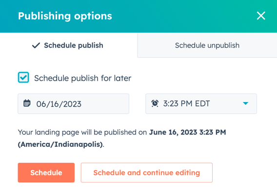
- To schedule a page for later publishing:
- In the top right, click the dropdown menu next to the Publish button, then select Publishing options.
- In the dialog box, select the Schedule publish for later checkbox.
-
- Click the date field and select the date when your page will be published.
- Click the time dropdown menu and select the time when your page will be published.
-
- Click Schedule, or click Schedule and continue editing to schedule the page's publication and return to the content editor.
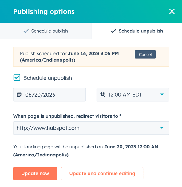
- To set your page to be unpublished automatically in the future:
- In the top right, click the dropdown menu next to the Publish button, then select Publishing options.
-
- In the dialog box, click the Schedule unpublish tab.
- Select the Schedule unpublish checkbox.
- Click the date field and select the date when your page will be unpublished.
- Click the time dropdown menu and select the time when your page will be unpublished.
- Click the When page is unpublished, redirect visitors to dropdown menu select a page. To use an external destination URL, click the dropdown menu and select Enter an external URL. In the dialog box, enter the URL, then click Save.
- Click Update now.
Optimize pages for search engines
In the Optimize section of the sidebar editor, you can view a page's SEO recommendations or attach it to a topic.
-
Navigate to your content:
- Website Pages: In your HubSpot account, navigate to Content > Website Pages.
- Landing Pages: In your HubSpot account, navigate to Content > Landing Pages.
- Hover over the page and click Edit.
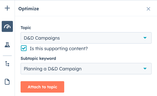
- In the content editor, click the Optimize icon in the left sidebar.
- To attach the content to a topic:
- To add an existing topic, click the Topic dropdown menu and select a topic for your page.
- To create a new topic, click the Topic dropdown menu and select Add core topic. In the dialog box, enter the topic, then click Save
- To attach the page to a subtopic keyword:
- Select the Is this supporting content? checkbox.
- Click the Subtopic keyword dropdown menu and select a subtopic keyword
- To create a new keyword, click the Subtopic keyword dropdown menu and click Add subtopic keyword. In the dialog box, enter the subtopic keyword, then click Save.
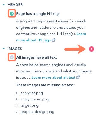
- To view incomplete SEO recommendations, click a category with a red circle. Each completed recommendation will have a green checkmark. Each incomplete recommendation will have a grey checkmark. Learn more about working with SEO recommendations.
Preview pages
Before publishing a page, you can preview it on different device types and test smart content and personalization. Preview links are designed to be shared internally with other users in your account; sharing them with external visitors is not recommended.
-
Navigate to your content:
- Website Pages: In your HubSpot account, navigate to Content > Website Pages.
- Landing Pages: In your HubSpot account, navigate to Content > Landing Pages.
- Hover over the page and click Edit.
- In the content editor, click Preview in the top right.
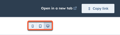
- To access a full page preview, click Open in new tab in the top right. To share this preview page with users in your account, click Copy link on the preview page. If the page is hosted on a HubSpot system domain, users must be logged into HubSpot to view this preview.
- To preview the page on a different device, click a device icon in the upper right of the preview page.
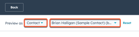
- To preview personalization or smart content, click the Preview as dropdown menu:
- Select Contact to preview the page's personalization. Then click the second dropdown menu and select a contact to preview how the page would appear for that contact.
- Select Smart rule to preview the page's smart content. Then click the second dropdown menu and select one or more smart rules to preview how the page would appear for a visitor matching those rules.
- To return to the page's default appearance, click Reset.